
The Urbane Collective Brand Identity
The Urbane Collective is a women-owned boutique corporate event production studio that supports C-level leaders and large organizations through high-impact, experience-driven events. Their work spans intimate executive retreats, large-scale conferences, and everything in between, always with a focus on precision, creativity, and a seamless client experience. They bring a rare balance of strategy and artistry to their process and are known for fanatical attention to detail, a deep network of trusted vendors, and the ability to turn complex logistical challenges into meaningful, standout moments.
As the primary designer and art director on this project at Shai Creates, I developed the entire Urbane Collective visual identity and digital presence from the ground up. I created the stylescape, logo system, badges, color palette, typography standards, patterns, textures, and all print collateral. I also photographed team headshots, produced AI imagery for use throughout the brand, illustrated custom assets, and designed the full website experience. While the larger agency team handled client communication, project management, and copywriting, I shaped every visual touchpoint to bring Urbane Collective’s world to life in a cohesive and memorable way.
Year Completed: 2025
Project Scope
Creative Direction
Logo and Badge System
Type, Color, and Visual Language System
Patterns and Textures
Print Collateral
Illustration
AI Image Creation
Headshot Photography
Web Design
Stylescape Development
Brand Guidelines
Credits:
Vada Morrison Lead Designer and Art Director
Shai Creates Agency Partner
Shai Newaz CEO and Project Oversight
Kiersten Sahlberg Copywriting and Project Management
Ashtyn Catoe Production Assistance
Stylescape
Logos
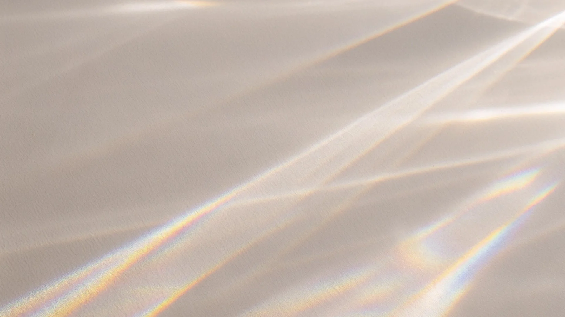
The Urbane Collective monogram brings the U and C together in a way that feels intentional, fluid, and genuinely meaningful. It tells a quiet little story about how the company approaches its work. The broken letterforms hint at the way a prism refracts light, which reflects Urbane Collective’s talent for taking complex ideas and turning them into fresh possibilities for their clients. The curved lines move like a flame and capture the passion, transformation, and steady energy that go into producing memorable, high-impact events. At the center, the diamond-shaped spark represents inspiration and clarity, the bright idea that starts each project and helps guide the team forward. The entire mark is held within a structured frame that reinforces Urbane Collective’s commitment to precision, thoughtful planning, and providing a reliable blueprint from start to finish. All together, the monogram feels both strategic and expressive, and it places Urbane Collective in the spotlight as a partner who knows how to elevate every experience they touch.

Badges
Colors
Each color in the palette ties back to a simple natural element with a hint of quiet magic. Lunaria reflects the soft glow of the moon, while Sandora feels like warm, sunlit sand. Solstice brings the energy of peak daylight, and Oliera carries the richness of pressed olive oil. Caldera holds the heat and depth of a volcanic crater, Cask brings the warmth of aged wood, and Nocturne settles into the calm of night. Together, they form a palette that feels earthy, luminous, and rooted in the rhythms of the natural world.
Typography
The type system blends personality with clarity. The heading font brings a sculpted, expressive feel that adds character to the brand. Field Gothic balances that with clean, modern structure for subheads and body copy. Big Moore adds a subtle touch of elegance for accent moments. Together, they create a clear hierarchy and a warm, cohesive look that feels both creative and professional.
Patterns
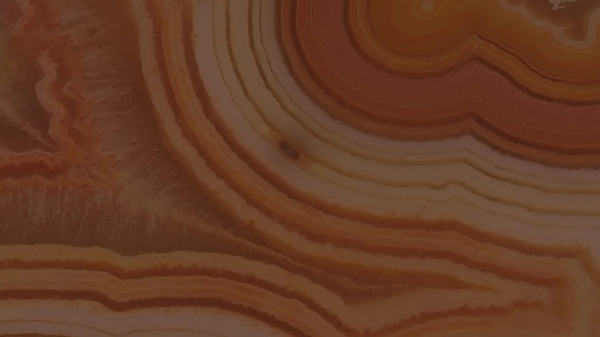
Textures

Illustrations